
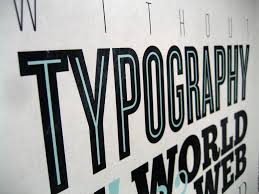
There is no single typeface that fits every project. Wouldn’t that be boring! Instead, you have at your disposal a plethora of typeface options that can be selected from to provide the right look for the content, be it a heading, banner or block of text.
The key, then, is to understand sound principles for selecting the perfect typeface for each location.
It Must Be Legible to your Audience
Readability is essential. Some typefaces are legible in a large size, but not on a small scale. Therefore, the larger the typeface will be, the more options you have. Artsy typefaces with lots of flair are tough to distinguish when small, for example, but fabulous when big and bold.
On the subject of legibility, consider the age of your readership. Perhaps this sounds ageist, but let’s be realistic. The older we get, the harder it can be to read typefaces that aren’t neat and clear. Readers can get quickly discouraged and click away to the next search result when trying to read “fuzzy” print, and that’s a warning to the wise.
A note on kerning: The spacing between characters is known as the kerning. Thick, bold characters can be spaced more closely together and still maintain an identity that is easier to distinguish. Thin characters and those with too much flair blend together easily when close together. This has an effect on readability. Keep kerning in mind as you consider typefaces for your web design work. This game demonstrates effective kerning.
Contrast Can Assist or Harm Readability
For reading, the clearest contrast is black type on white background. From there, contrast deteriorates by degrees. Provide sharp contrast that is pleasing to the eye; avoid sharp contrast between two bright colors, as it can overwhelm the eye and cause discomfort.
Match Typeface to Text Subject
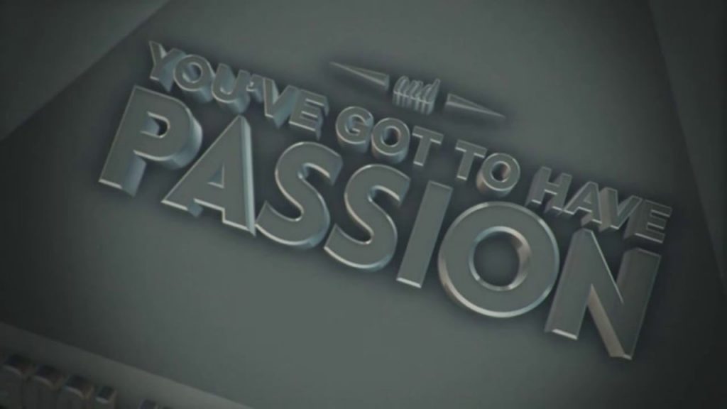
This is common sense, of course, but it goes unheeded so often. Are you presenting the title of a fairy tale? Then something whimsical is waned. However, the same typeface would be horribly out of place to title a story about a puppy with its head caught in a fence.
Simply asking, “is that a good fit?” and being honest about the answer will keep you on the right track here.
Gather Go-to Typefaces
You know the drill. You’ve got a headline or short paragraph that is begging for something out of the ordinary, so you spend ten minutes or more trying out different typefaces only to end up unsatisfied with the results.
Experienced web designers keep a list of their favourite typefaces where they can quickly review it to find one that suits the need of the moment. Categorise them, if you’ve got several that are similar, using terms such as traditional, modern, fun, urban, youthful, authoritative, business-like and dramatic.
Keep adding to your list of go-to typefaces, so your web designing won’t get stuck in a predictable rut. Keep it fresh for you and for your readers!
Use Variety in Good Measure
Pros minimize the number of typefaces used in any section of a web page that can be viewed together. Two typefaces that work nicely together is wonderful; if you’ve got a third that blends well with them, use it in small doses like an accent. Presenting more than three typefaces to the eye rarely looks right. Readers will think someone got a bit carried away!
As a specific rule, many web designers effectively combine a serif typeface such as Times New Roman or Courier with a san serif such as Arial or Helvetica. Studies show that sans serif typefaces are harder to read, so use them sparingly and, perhaps, where the typeface is large.
Keeping these simple rules handy will make you a master to typography!