
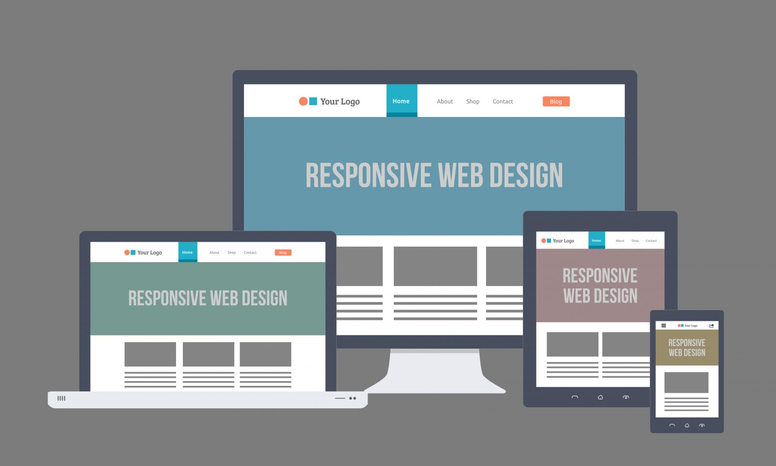
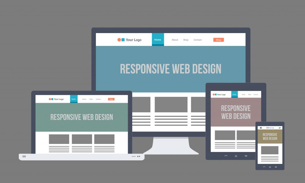
The idea of having a responsive design for your website to adjust any screen size seems great, doesn’t it?
Designers and developers at Hire Magento Developer are very passionate about responsive web designing and have done a number of projects meeting clients’ requirements. So, optimizing the look and functioning of your website seems like a no brainer for them. With the growing use of mobile devices, everything on the web will be responsive in the days ahead.
There are many user-centric reasons for developing a site only for a particular screen size or device, but if you’re choosing to go with RWD, you’re providing the usability for a variety of devices.
The decision to invest in Magento Responsive Design for your ecommerce store won’t be only because you have a huge traffic coming to your site through their mobile devices. There are many other reasons that cheer for responsive approach.
But, there are certain things which are critical for your website and you should know before going responsive.
What are the influential factors you should think before deciding to go responsive?
- CSS3 Media Queries: Responsive designs are totally dependant on the CSS3 media queries which tell the browser when to shift the elements around for the screen size. You can set up different pixel ranges and when the screen loads within a particular pixel range, it will adapt the display based on the specifications you’ve set for that range.
The fact is that you need to do a lot of work to get into making a responsive design work properly in all the ranges of device sizes.
- You’ll Not Be Able To Please Every User: To establish trust in your website’s design, the factor that plays a significant role is familiarity. A change in your website may breed uncertainty in users. So, if you’re introducing a responsive web design to your existing website, you can the alert mobile and tablet users of the new design with a link to an article explaining the design decisions.
- Poor Responsive Designs can Affect Usability: There are plethora of responsive websites that do not load or respond well, do not degrade gracefully, especially the desktop versions forced into a smaller viewport. Simply swapping various elements under each other will result in very long pages usually. Moreover, the images can slow down your site’s performance and this is a vital issue for users on mobile devices. Hence, take into consideration proper time and budget, not just blow out.
- Bandwidth Issues: Another responsive design factor worth considering is bandwidth and loading time for various devices. Websites heavily loaded with images will most likely be very slow to load on a mobile device where 3G is only the available network.
A slow site will degrade the user experience and cause decreased conversions, higher bounce rates, and confuse the users. There are various ways developers are trying to solve this problem now. And one method which is commonly used is serving different images specific to that device size depending on the screen size. This way, you would create a main image for the desktop version which would be the largest size of the image, then resize that image for tablets, smaller tablets and phone sizes.
Voilà! You don’t need to serve a very large image and this image will then be scaled down to fit the smaller window of a phone which is a huge waste of bandwidth and load time for the user.
Conclusion:
When it comes to responsive websites, they should be designed for mobile first, ensuring the core functionality for the mobile devices and browsers with limitations. Then, with progressive enhancement the design can be embellished as the screen size and/or resolution increases.