
The perception of colors is one of the most controversial and interesting aspects of marketing. The way we, as people, respond to particular colors has been studied by both behavioral psychologists and psychiatrists, as well as economists and, most importantly, marketing specialists. The relationship between color and how we act, react, and behave has been studied for hundreds of years and continues to baffle scientists even today.
An indisputable fact is that most of our present day communication channels are dominated and easily identified by their colors, hues, and slight change of tones. Many psychologists agree that our brains are wired to facilitate the communication process and the change of ideas with the help of color association. Similar to smell, we associate colors with certain personal feelings, preferences, and desires.
Simply put, we are more receptive to a particular color scheme when compared to another, depending on our mood and what feeling we associate with each color. What’s more, we also associate colors with personal feelings. For instance, black is the universal color of sadness, morbidity, and depression, while red is the color that provokes the most response among humans and is almost universally used to attract attention.
To understand the full mental process between the perception of colors and how we act upon seeing them, we need to analyze some of the facts that have intrigued both marketing specialists and psychologists. Are we really more receptive to some colors, rather than others? What can we learn from this fascinating aspect of human behavior and how can we use these results when creating banners, signs, and other marketing devices?
Since the beginning of commerce, branding has been one of the most important areas where business owners have tried their best. Building a long lasting and trusted relationship requires a well-established brand, and a quick and effective visual way to create this is via colors. There have been an astonishing amount of articles and books written on our different responses to various colors, especially in a commercial setting. We are more likely to buy a product depending on its color, and we are more likely to enter a bookshop that has a certain color in its logo.
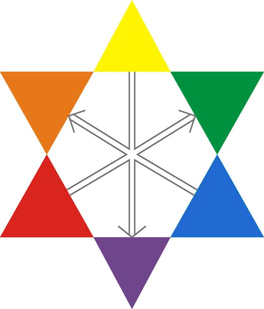
Here is a list of some colors and how they make us feel:
- Yellow is associated with optimism, warmth and cheerfulness
- Orange makes us friendlier and more confident
- Red reminds us of youthfulness and boldness
- Purple activates our imagination and creativity
- Blue creates a sense of seriousness, strength, and quality
- Green symbolizes growth, health, and positivism
- Gray hues make us calm and bring balance to our life
While this short list is valid in most cases, our personal receptiveness depends vastly on our cultural, emotional, and economic backgrounds. As a matter of fact, our personal reaction to certain colors can only be determined after an in-depth study and cannot be universally translated in particular emotions or moods.
However, colors play a significant role in sales and branding, and many companies adhere to these simple color rules. For instance, almost all payment buttons in online stores are orange, while many charity websites have green color schemes. This also rings true for brick and mortar businesses: family restaurants logos and signs abound in yellow, orange or light red hues, which make us friendlier and calmer. Similarly, some marketing specialists suggest that almost 90 percent of snap buying decisions are done depending on the color and what feeling the respective color creates.
Also, we judge the “appropriateness” of particular colors in a snap judgment. We rapidly decide whether a color fits a certain environment, setting, or field of work. As a matter of fact, we are more responsive to the appropriateness of the color in relationship with the product, than we are towards the color in itself. All these elements, which are all color related, create a sense of “personality” for a certain brand. Moreover, most of our decisions are made based on the perceived character of a certain product, service or company.
The writer, Flaviu Mircea, is himself a marketer who recognizes the importance of particular colors in selling a brand or product to people, and how one misstep could mean disaster. This also means when ordering banners, he needs a company that will get the job done right. For this he recommends using the custom banner design tools available at Quality Sign Designer. You can learn more about Flaviu on Google+.