
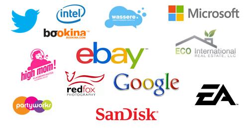
We have seen those familiar logos used by successful companies in the market. Some logos are well-designed, while other companies tend to mess up logos and they eventually confuse customers. In general, it is better to leave our logo off if it already works well. One tricky thing is that logos are often associated with taglines and many business owners tent to assume that any logo should include one.
It is true that an excellent tagline can help with our marketing, but many popular logos out there don’t have any logo. It should be noted that adding extra elements like taglines can become more complex. It is also more difficult to remember more complex logos. We should think of more popular logos in the market and we should ask to ourselves why they are easy to remember.
Whatever we do, we should avoid adding elements that tend to clutter our logo and the best logos out there are usually very simple. Many popular logos are essentially just an icon, but they could also business names with a short tag line. It should be noted that adding extra elements like web address and phone number will make our logo looks very cluttered. The more elements we incorporate in our logo, the less likely consumers will remember our logo.
We should also avoid using too many colors, because they can be very distracting. When it comes to helping people remember our visual identity, an overall simplicity is always essential. Many popular brands use one or two colors to better represent their business. Black and white are the most common colors selection, because they are very noticeable. However, we could also use other colors to help people memorize our brands better.
Using fewer colors could also make it easier if we want to embroider the logo onto our uniform. Simple logos can also be integrated more easily with promotional materials and give-aways. We should also avoid using gradients and shades, because it will make it harder incorporate them in many platforms.
It is also important to avoid adding too many fonts and using a twisty, complex will make it much harder for consumers to decipher our logo when they unconsciously glance at our logo for a fraction of second. Unless we have a very compelling reason, we should use only one logo.
At this stage, we may sound like a broken record by advising this repeatedly, but we should always make things much simpler. Fonts that we use should be easily readable and they should be able to represent what our companies stand for.
In some cases, there is exception to any rule and there are some logos that work much better with more color. Some logos could also look compelling, if we implement a clever use of two or even three fonts. Whatever extra elements we incorporate to our brand, it should give context to the overall design. Logos are often considered as the very first representation of our company.