
Responsive websites are the IN thing these days, and surely, they are here to stay. What can please the expressive web surfer more than a website that loads in perfect response to the dimensions of the screen that is exhibiting it to the eyes of the beholder! And, the website is a sure shot winner with a gallery of thumbnails that maintains the quality tag of the responsive website and gets displayed in perfect harmony with the gadget’s screen size. 
I intend to explain the method of building a responsive thumbnail gallery in a responsive website. Obviously, web developers would want to quickly go through a tutorial explaining the simplistic designing of a responsive webpage before adding another feather to the cap in the form of a responsive and impressive gallery of thumbnails. Responsive website designing is a lengthy journey, but you’d be more comfortable once you know how to steer around a responsive gallery designing problem.
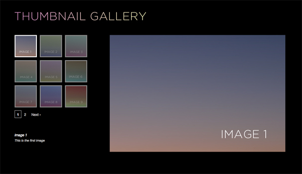
It would not be a bad idea to see what you want to get. Infuse some motivation and direction by looking at a few web pages hosting responsive thumbnail galleries. Try changing the browser screen size and see how the gallery responds. Enough of appreciation now; time for action. Here we go.
Begin with some quick image collection. Give a title and a short description to each image. You could make use of already uploaded images in your web site gallery, but there is little chance that each of them would have titles and descriptions; so, be flexible and collect some stunning images to add life to your responsive website. Let us not defer the coding, and brace ourselves for it. Here is a format for an image block, with description and title.

| <div class=”container”> <div class=”galleryItem”> <a href=”#”><img src=”…” alt=”” /></a> <h3>Title</h3> <p>Lorem ipsum dolor sit amet…</p> </div> <div class=”galleryItem”> <a href=”#”><img src=”…” alt=”” /></a> <h3>Title</h3> <p>Lorem ipsum dolor sit amet…</p> </div> </div> |
You can observe two classes in the above description – container and galleryItem. In addition, there are images, paragraphs, and H3 tags. You can easily add more pictures to the gallery by just copying the galleryItem div container. Now, on with the CSS work.
Now that we are into the styling part of the business, let us be ready to mix some creativity and visualization to our coding efforts. You’ll be fine, just read this part carefully and try to envisage things as you indulge in the coding. Would not it be nice to give ourselves a nice and neat container centred on the page to begin with? This code fragment does that for you.
.container {
width: 80%;
margin: 30px auto;
overflow: hidden;
}
Done; you have given yourself a nice and wide area to play in as far as the gallery is concerned. Just look again at the above code lines. Notice how I have defined a percentage for the width; this ensures that there is a lot of fluidity in terms of the container’s width according to the page size. Remember, perfect responsiveness does not mean making the website fluidic and adjusting for certain breakpoints. In fact, you should shoot for a website that adjust equally well to any size. That’s what I am trying to achieve here.
Let us be bold here, and drive further inside this coding tunnel. Do not lose sight of the intriguing responsive webpage on the other end of this tunnel! We are now going to play with the galleryItem class’ styles. We’ll be creative and will manipulate the size of text, and its color. Plus, we’ll make the items float to the left. Here’s the code.
| .galleryItem { color: #797478; font: 10px/1.5 Verdana, Helvetica, sans-serif; float: left; } .galleryItem h3 { text-transform: uppercase; } .galleryItem img { max-width: 100%; -webkit-border-radius: 5px; -moz-border-radius: 5px; border-radius: 5px; } |
See how I have styled the different parameters of the image in the above code fragments. Most noticeably, I’ve defined the image width as 100%, which is as good as ensuring that the images will adjust themselves with the changing page size. Also, I have been rather adventurous, and added rounded corners to the images. Next, we are going to add column widths. Do you think we can stop, pat ourselves on the back a little, and see how things have panned out till now? Yes we can. Here is what you have got till now – a wide column with thumbnails, but text not exactly in position.

Put on your mathematician’s hat for a minute now. You need to work out some percentages for the elements of the gallery. Let us take a five column layout. Here is how you calculate the percentages. Answer the following.
How many columns do you have in the layout?
How much space (in percents) do you want to allocate to margins between the columns?
We’ve already answered the first question; we will have 5 columns. Let us say that we will allot 4% margin space between the columns.
Now, here is how the math works.
Space for margins = No of margins required x Percent allotted to each margin
Width for each column = “(100 – Space for margins)%” divided by “Number of columns”
This means that we have 5 x 4%, that is 20%, set aside for margins What is left? Yes, 80% of the space of the container. So, each column width is “80% divided by 5 columns”, that is 16%.
Here is how the details we have chalked out get converted to code for CSS. Just keep in mind that one column is represented by each .galleryItem class, and the column has occupies 16% space, with 2% margin on either side (totalling to a margin of 4%).

| .galleryItem { color: #797478; font: 10px/1.5 Verdana, Helvetica, sans-serif; float: left; width: 16%; margin: 2% 2% 50px 2%; } |
We are done with a huge part of our job already. Our gallery will be responsive for decent screen sizes, let’s say 13 inches or more. However, for really small screen sizes under 500px width, there is a problem. The image titles and descriptions lose readability.


There is a solution available, and we are going to use it. To make our columns reflow to adequate sizes, we’ll insert some breakpoints by using media queries. Here’s a simple technique to decide on fixing breakpoints, without getting lost in the spectrum of advices and tips that the developers’ guides are flooded with. Open your page, progressively reduce the screen size of the browser, and see where the column text becomes too compressed to be readable. You’ll notice that around 940px, the text in the columns becomes too tiny to be impressive enough.
What’s the solution? Simple, just reduce the column count from five to four, and do this at the breakpoint you’ve just found out. Work out the mathematics as explained earlier, and you’ll have column width of 21% with 4 columns and 4% margin. Here’s the code for this.
| @media only screen and (max-width : 940px), only screen and (max-device-width : 940px){ .galleryItem {width: 21%;} } |
Notice how both “max-device-width” and “max-width” have been used in the code to ensure that the design reflow happens whenever the webpage is opened on a gadget with screen size less than the defined size, as well as in a window less than that size even if the device screen is larger (your desktop’s browser window, for instance). With this done, our gallery design will change from a five column layout to a four column layout when the screen size goes less than 940px.


Just repeat the process of reducing the window size further to find the second breakpoint, or the screen size when the 4 column design turns unreadable. You get the idea, right? I’m sure you do! In this example, the breakpoint comes at around a screen size of 720ox. Here is the code to solve the problem.
I am also giving the code to handle all breakpoints for the above example of 5 column design.
| /* MEDIA QUERIES*/ @media only screen and (max-width : 940px), only screen and (max-device-width : 940px){ .galleryItem {width: 21%;} } @media only screen and (max-width : 720px), only screen and (max-device-width : 720px){ .galleryItem {width: 29.33333%;} } @media only screen and (max-width : 530px), only screen and (max-device-width : 530px){ .galleryItem {width: 46%;} } @media only screen and (max-width : 320px), only screen and (max-device-width : 320px){ .galleryItem {width: 96%;} .galleryItem img {width: 96%;} .galleryItem h3 {font-size: 18px;} .galleryItem p, {font-size: 18px;} } |
Right then, how does the first sight of your responsive webpage with a responsive gallery look? And, how about the idea of manually finding out breakpoints? Let your comments be known.
Featured images:

Jake is a WordPress designer and a part time blogger. He regularly shutterstock coupon code from The Designshack to get discount when buying HQ images.