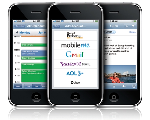
With more and more people gaining access to mobile devices each day, companies have started running mobile marketing campaigns. If you, as a company thinking of running a marketing campaign, you must havea design which is mobile friendly. According to research, more than 49% of email campaigns are now being opened on mobile devices, but more than 88% of the mobile email marketers are losing potential customers because they have not optimized their emails for them to be run on a mobile device.
If you are looking at making your mobile email better, here are some simple and easy tips that will help you to start doing so in a right way.
- Use of MailWise services: There has been an increase in android and apple mobile devices and MailWise has come in handy to help marketers looking to optimize their mobile email campaigns. Using MailWise will not only see you increase your sales, but your clients feel secure about your professionalism when using Mail Wise.
- Images should be resized to the proportion of your target screen: If the image is not resized, it gives the user a terrible experience. It is easy to make your images fit whatever screen you are targeting your email to be opened on. When designing an email for mobile marketing, the image size can be defined by the proportion of the screen rather than the screen. This is by use of an HTML editor to adjust the style portion of the code.
- Image sizes should be reduced: According to a research carried out, 94% of advertisement views are attracted by the compelling images rather than the content that does not contain images. There has been an increase in mobile download speeds and if your images are large, they may cause your page to load slowly than on desktops. Lack of speed kills and demoralizes people from visiting your site. Every one second delay in loading time brings about a drop in sales conversions. Use of services such as jpeg mini can reduce your images without affecting the quality of your image.
- Increase the link size and call-to-action buttons: This is mainly to target the different sizes of the finger thumbs. Users with big thumbs may find it harder click on the link found on the email. For an effective and the best user experience, the links and call-to-action buttons should be spaced far enough from each other to avoid accidental clicking.
- Create your own responsive template according to your niche market: If you are not good at designing an effective responsive email template, you can acquire one from companies such as MailChimp. Responsive templates will help you avoid losing valuable opportunities.
