
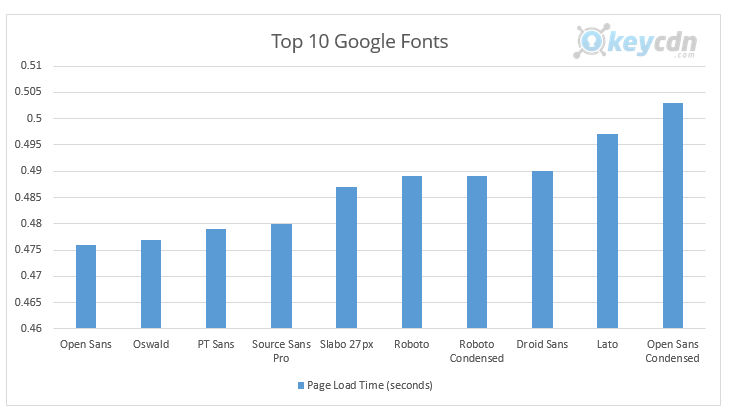
The art of typography has been around since humans first began scribbling their notes on rocks and cave walls, but in the last couple of centuries or so it has experienced a truly unprecedented boom. Thousands of fonts have been created and marketed, some of which are as iconic as movies or songs at this point. With the advent of the Internet, many of them were created solely to exist online and provide distinct flavors to the web-surfing experience. Which is why it’s important to understand just how fonts affect website design and how to employ them properly in order to forge a connection with your viewers. With that in mind, here is a list of general guidelines that have been shown to boost user retention and are usually considered among the golden rules of Internet typography:
Size Matters
Fonts come in all shapes and sizes, so it’s reductive to assume that one size fits all in this case. Still, research has shown that people have a marked preference for visible writing that stops just short of becoming an eyesore. For instance, Verdana looks best at a 10-point size, while Arial works better at 12 and Comic Sans goes down easier at 14.

The Eternal Battle between Reliability and Originality
With so many fonts at your disposal, it’s fairly easy to be tempted by the funkier ones. But different doesn’t necessarily mean better in design. A perfect font has to convey your brand’s unique message, but it should do so without distracting people from the actual content. That’s why reliable fonts like Helvetica and Franklin have proven so popular over the years. People enjoy looking at something that’s easy to read, even if they’ve seen it time and time before, but that doesn’t mean you shouldn’t try something new every once in a while.
On Avoiding Caps and Exclamation Points
Everyone has that one friend who always types like he’s on the verge of capping off his 3rd Red Bull in a row. However much you want to convey excitement and immediacy, it’s almost never a good idea to resort to using caps and exclamation points. Caps, especially, in addition to making things harder to read, also mess with your coastline, aka the shape that the boundary of a word makes. Since people are used to reading lowercase text 95% of the time, an uppercase word will often disorient and confuse the eye, and not always for the right reasons.
Letter Spacing
An essential part of what makes text legible lies in the delicate art of letter spacing. This refers to the density of the text itself or how close the letters are to each other. Typing with high density will give you more words per line, but it might also cause everything to look squished together, therefore making it hard to read. Excess spacing, however, can be just as damaging, as it forces the reader to continuously jump from letter to letter to form an actual word. A good rule of thumb for letter spacing is to have it at around 120% of the font size.
That just about wraps up our quick primer on fonts and their impact on a website’s performance. Since design is by definition a matter of taste first and foremost, feel free to improvise and occasionally color outside the lines in order to define your own style.