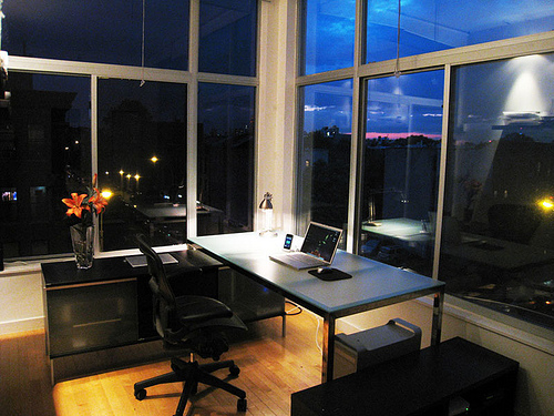
When it comes to office design, less is more: employees should be busy about their work, but a design that’s too busy only adds to the stress of the job. If you want to impress both clients and employees with your office design, they should find a space that is functional and effortless.
Choosing Colors and Textures
Favor simplicity over complexity by sticking to straight lines and solid colors. Color can bring vibrancy (both literally and figuratively) to the workplace, so don’t be afraid to cover boring grays and beiges with bright blues, vivid reds and glowing oranges. Just don’t overdo it — two to four well-matched colors will do the trick.
Textures, too, can be a useful design element. If your office space has exposed brick or stone, ductwork or building supports, don’t think that you have to cover them. Incorporate them into your design instead. Not painting parts of your office lowers costs, too.
Functional Design
Your office is first and foremost a space to get work done. How your office is arranged should reflect the work you do. If your product or service relies on collaboration among colleagues, your workspace should be relatively open so people can see one another, and with areas in the open and behind closed doors for both ad hoc and scheduled collaboration.
Your use of color and texture can add to a functional design, too:
- Use color and texture on the walls and in the carpet to designate specific work areas without losing the floor space that would follow from installing actual walls.
- If you or your employees have received industry awards, paint a section of wall in the waiting area an attention-getting color, tap some box nails into the wall and hang those framed awards for all to see.
- Dry erase boards often appear in creative spaces — why not paint an entire wall with dry erase paint instead?
Effortless Design
Splashing a mish-mash of colors, patterns and textures all over your walls won’t make your office look like a young, vivacious workplace. It will look like you lack focus. If your office design looks like you’re trying too hard to be creative and cutting-edge, you aren’t trying hard enough to be creative and cutting-edge.
A good office design looks like it took little to no planning. The workspace layout should feel obvious, and the colors and textures on the walls should coordinate. Consider what you want clients’ eyes drawn to the most and use color to emphasize that one thing over all others. A busy design will have clients’ attention bouncing all around the office; a simpler design with a single focus is more calming.
Don’t do it All yourself
When you’re thinking about color, texture, layout and the overall design of your office space, you need to consider your clients’ impressions, your employees’ comfort and efficiency and your company’s business culture. That’s a lot to take in.
So rule number one should be this: Don’t do it all yourself. Solicit employees’ opinions about how they work and what will help. Ask new clients about their first impressions of the office. Ask people who aren’t connected to your company what impressions they get. Then feed all this information into your design plan to find what will really work.
