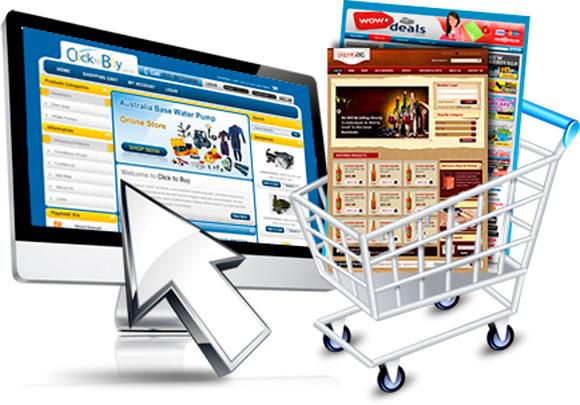
Can a simple site redesign raise your sales? If you have the type of design that doesn’t easily convert customers or makes it hard for them to purchase, it can be costing you money. Good ecommerce designs don’t just rely on a specific shopping cart to do all the work. They are customized to make sure that the visitors who come to the site have the best shopping experience that encourages them to buy your products.
Search-Friendly
What’s the point of having a website if someone can’t find what they want instantly? Search features are the reason it is supposed to be easy to shop online, but only if you’ve customized the search functionality for your buyers. Here are a few things you need to make easily accessible to find on your site:
Categories and Specifics
Search functionality should have easily recognized categories and specific drill-downs that can lead a buyer to that large-sized purple shirt they couldn’t find at their local department store. The easier you make it to find things, the more likely they’ll search some more.
Budget Levels
Some people want to sort from the least expensive to the most. If you don’t have that breakdown, then people can get tired of trying to search for something they know won’t fit in their budget. They will assume your store isn’t worth it and leave.
Deals
Are the closeouts, discounts, and deals clearly marked and advertised? Are they differentiated in any way in your search results? These ads should be placed prominently on the home page as well as detailed and highlighted in the shopping cart results.
Pictures
People don’t search by text alone. Having pictures of items that show up in a pin board fashion makes it easy for a customer to view multiple colors and styles at once. It helps them to zoom in on their likes quickly.
Multiple Payment Options
It’s one thing to find what you’re looking for easily and another to pay for it without much hassle. If a shopping cart has a limited number of payment options, you filter out people who don’t have the payment option they can meet. Make sure you take as many payment options as possible when dealing online. PayPal may seem like an additional headache, but if that’s what your customer buys with, you’d better hope it’s available in your shopping cart; otherwise you can lose the sale.
Ensure a Smooth Checkout
Make sure the payment process is effortless and reduce the desire to add extras like shipping or other fees that will turn off the client at the last minute and cause them to walk away. The fewer surprises upon checkout, the better. That deal is not closed until the buyer confirms the sale, so don’t give them a reason to stop and pause and reassess the decision to buy. If they do happen to click away from your site to see something else, make sure their checkout cart remains full and that they can easily resume the process from where they left off. If they come back and find out things are missing or there is a payment glitch, they will likely lose confidence in the cart and leave before they charge anything on their cards. Keep the process as smooth as possible and anticipate that the buyer may not be fully engaged upon checkout, so don’t offer additional distractions with new offers or fees during the process until after you’ve collected the money.
Benjamin Ben Sawyer is the Content and Social Marketing Manager of Paramold.com . He loves to blog about ecommerce, web development and internet marketing. He is also a co-founder of small consultancy agency that uses advanced techniques to achieve extraordinary results for ecommerce businesses.
